
티스토리 뷰
CSS 윤곽선 둥글게~
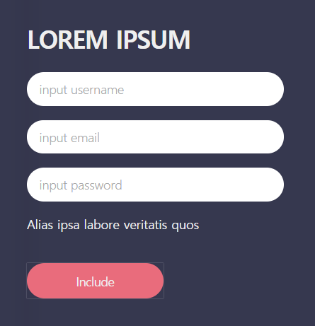
이런 폼을 만들어 보던 도중에... <input>의 아웃라인에는 border-radius 스타일이 먹히지 않는다는 걸 알게 되었다.
<div class="main_con_form">
  <div class="form_inner">
    <span><h1>LOREM IPSUM</h1></span>
    <div>
      <ul class="form_list_input">
        <li><input type="text" id="name_input" name="name_input" placeholder="input username"></li>
        <li><input type="email" id="email_input" name="email_input" placeholder="input email"></li>
        <li><input type="password" id="pw_input" name="pw_input" placeholder="input password"></li>
        <li><span>Alias ipsa labore veritatis quos</span></li>
      </ul>
    </div>
    <div class="enter_btn"><button>Include</button></div>
  </div>
</div>
HTML 부분
/* RESET */
* {
  box-sizing: border-box;
  padding: 0;
  margin: 0;
}
body { background: #36384f; }
body, a, p, input, button, span {
  font-size: 14px;
  text-decoration: none;
  color: #36384f;
}
li {
  list-style: none;
  cursor: pointer;
}
button {
  cursor: pointer;
  border: 0;
}

/* STYLE */
.main_con_form {
  text-align: left;
  padding: 40px;
}
.main_con_form span {
  color: #efefef;
}
.form_inner {
  width: 100%;
  height: 100%;
}
.main_con_form h1 {
  font-size: 28px;
}
.form_list_input {
  width: 254px;
  height: 100%;
  margin-top: 20px;
}
.form_list_input li {
  height: 54px;
}
/***** INPUT *****/
.form_list_input input {
  padding: 0 1em;
  border: 0;
  height: 38px;
  width: 100%;
  border-radius: 30px;
}
.form_list_input input:focus {
  outline: none;
}
.form_list_input input::placeholder {
  font-weight: 300;
  color: #aaa;
}
.form_list_input label {
  float: left;
  display: none;
}
.enter_btn {
  width: 100%;
  height: auto;
}
.enter_btn button {
  overflow: hidden;
  width: 154px;
  height: 40px;
  color: #efefef;
  background: #e96c7c;
  border-radius: 20px;
}
CSS 부분
좀 정리가 안 되어 있는데 주석으로 input이라고 써있는 곳부터 보면 된다.
.form_list_input input:focus {
  outline: none;
}
신경 쓸 건 요 부분!
<input> 태그에 포커스가 가면 분홍색 테두리가 생기게 하고 싶다. 기본 테두리 스타일은 지워둔 상태다.
.form_list_input input:focus {
  outline: 3px solid #e96c7c;
}
평소에 쓰던 방법. outline 혹은 border로 작성한다.
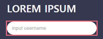
원하던 이미지가 아니다... 나는 텍스트박스에 꼭 맞는 테두리를 원했다. outline에는 border-radius가 안 먹히는구나... 이때 알았다.
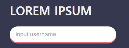
어떻게 할까 하다가 또 가끔~ 써먹는 방법.
.form_list_input input:focus {
  outline: none;
  box-shadow: 0 0 0 3px #e96c7c;
}
원래 box-shadow는 그림자를 만드는 용도지만 그림자가 번지는 정도를 0으로 설정해주면 아웃라인처럼 구현이 된다. 숫자는 왼쪽부터 x축, y축, 번지는 정도, 그림자 두께를 가리킨다. 위치는 제자리에 두고 두께만 3px로 맞춘 것.

See the Pen by yee0 (@yee0) on CodePen.
'공부중 > HTML ⅋ CSS' 카테고리의 다른 글
| [HTML & CSS] on off switch(스위치) 만들기 (2) | 2021.09.09 |
|---|---|
| [HTML & CSS] 그라데이션 만들 때 참고하는 사이트 추천 (0) | 2021.07.26 |
| [HTML & CSS] <div> 안에 <div> float로 정렬하기 (0) | 2021.05.21 |
| [HTML & CSS] 내 맘대로 기본 세팅 (0) | 2021.05.18 |
댓글
| 일 | 월 | 화 | 수 | 목 | 금 | 토 |
|---|---|---|---|---|---|---|
| 1 | 2 | 3 | 4 | 5 | 6 | 7 |
| 8 | 9 | 10 | 11 | 12 | 13 | 14 |
| 15 | 16 | 17 | 18 | 19 | 20 | 21 |
| 22 | 23 | 24 | 25 | 26 | 27 | 28 |
| 29 | 30 |
최근에 올라온 글
글 보관함
- Total
- Today
- Yesterday
TAG
- slideToggle
- 웹디자인기능사실기
- JavaScript
- box-shadow
- object
- 객체정렬
- 첫글
- 사이트추천
- 구구단
- Class
- 3단메뉴
- jQeury
- switch
- input
- hammy
- float
- 자격증
- jquery
- border
- Gradient
- if문
- css
- html
- a
- 웹디자인기능사
내 햄수터